
Project Overview
Thought Industries (LMS)
Led UX design and information architecture; co-designed learning journey structure, authored courses and assessments within the LMS
New joiners, experienced learners, Enablement Managers, Learning Experience Designers
Existing LMS with no backend changes; needed a scalable structure
Graphic Designer, Developer, Subject Matter Experts, Developer
100% reduction in manual effort for Enablement Managers, 75–80% learner completion, 4.4/5 learner satisfaction, Scaled to 6 departments by Sept 2025
"How might we design a scalable, flexible onboarding experience that gives learners clear, relevant guidance — while eliminating manual effort for Enablement Managers and staying maintainable for the team building it?"
The Problem
Every department onboarded entirely outside the LMS through individual Excel sheets — creating invisible progress, manual overhead, and no structured learning journey. The challenge was designing one system that worked for four different user types simultaneously.
Every department ran its own onboarding, but entirely outside the LMS, through individual Excel sheets.
Each new joiner received a spreadsheet combining LMS course links with external tasks. They were expected to work through it independently, switch between multiple applications, and manually mark tasks complete as they went. Many forgot. Progress became unreliable, and Enablement Managers spent significant time chasing completions and updating dozens of sheets whenever anything changed.
The downstream impact was real: when new joiners didn't complete onboarding on time, they weren't project-ready. The teams, depending on them to contribute quickly, felt it.
From a learning design perspective, the problem went deeper than just the system. There was no structured journey, no sense of sequence, priority, or progression. Learners couldn't see where they were going or how far they'd come.
The challenge was to build something that worked for four different users simultaneously: new joiners, experienced learners, Enablement Managers, and the Learning Experience Designers who would need to maintain it.
Scope & My Role
I led UX design and information architecture across the full project, from research through to LMS build and rollout. This was a three-person team effort with clearly distributed ownership.
I led the effort to design and structure department-specific onboarding journeys within the LMS.
My responsibilities included:
- Analysing how departments onboard new hires
- Identifying gaps and inconsistencies in onboarding processes
- Structuring role-based onboarding pathways
- Translating onboarding requirements into LMS learning journeys
- Coordinating with department stakeholders to align learning needs
- Supporting implementation and rollout within the LMS
I collaborated closely with a three-person team: one member focused on content structure, another coordinated stakeholders, and we all worked with Enablement Managers throughout
Constraints
The solution had to work within an existing LMS with no backend changes, support significantly different requirements across departments, and be easy for the Academy team to maintain and scale.
- Department onboarding requirements varied significantly across teams, meaning the system needed to support flexibility without becoming overly complex
- Additionally, the solution needed to work within the capabilities of the existing LMS, which limited how onboarding journeys could be structured
- This required designing onboarding pathways that were both scalable and easy for us as the Academy to maintain over time
Investigation
Ethnographies with Enablement Managers and learners across departments revealed three distinct pain clusters — one per user type. The research directly shaped the structure of the solution.
We started by mapping the existing Excel-based workflow:
- Each learner had a separate sheet with LMS and external tasks
- Managers had to update dozens of sheets whenever anything changed
- Learners frequently forgot to log completions and were confused about the next steps
Next, we conducted ethnographies with Enablement Managers and learners across departments to ensure that we had understood the problem correctly and our solution would actually solve their problems.
Key Insights
Enablement Managers
- Onboarding required frequent manual follow-ups and one-to-one guidance
- Every course or task change meant updating dozens of individual sheets
- There was no easy way to track learner progress or identify where learners were getting stuck
New Learners
- The volume of content was overwhelming, with no clear starting point
- Switching between the Excel sheet and the LMS constantly broke their flow
- They couldn't tell what they'd completed or what came next
For Experienced Learners
- No tailored materials for their needs.
- Onboarding materials remained visible long after they were relevant.
One further constraint emerged clearly: whatever we built, it had to be easy for LXDs to adapt and scale to new departments without rebuilding from scratch each time.
The Solution
A standard training track wouldn't work. The LMS didn't allow embedding one track within another, and a flat list of 40+ courses created exactly the kind of cognitive overload we were trying to solve.
As a team of three, we brainstormed across both learning design and UX lenses. The breakthrough came from combining two insights:
- Structurally: department-owned spaces within the LMS. Each department gets its own landing page, its own content, its own rules. A one-stop shop that Enablement Managers could own.
- From a learning design perspective, separating content by learner stage would prevent overwhelm and ensure relevance. Showing a new joiner the same content as an experienced colleague or vice versa served neither well.
Now that we had our idea, it was time to get to work. We distributed the ownership of the areas, though we all supported each other:
- One team member focused on content structure
- I led the experience and interface design
- Another coordinated stakeholders
Early concepts were sketched on paper and reviewed internally. I then created interactive prototypes and conducted usability testing with five Enablement Managers across different departments.
Feedback was implemented, and final iterations were made before build and rollout.
The Analytics team was involved in setting up a dashboard for Enablement Managers to track the onboarding journey, along with providing them with the necessary metrics.
Here are some final designs along with the solutions.
Please note that certain parts have been masked for confidentiality.
Core design decisions
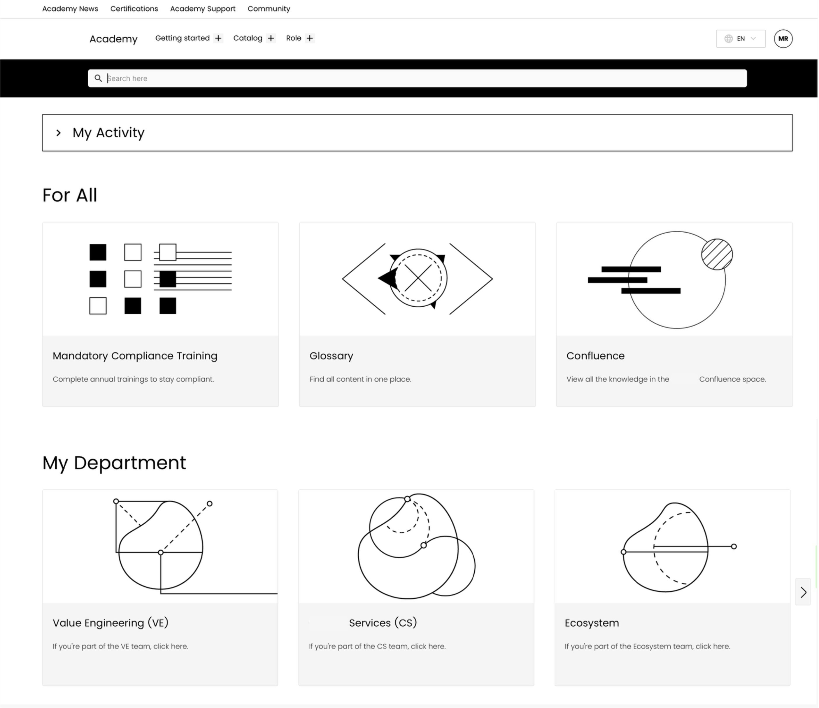
Introducing the 'My Department' Space
I redesigned the LMS landing page to reduce cognitive load at the point of entry by removing low-traffic pages, simplifying navigation, and introducing a department selector as the primary entry point.
Learners now arrived, selected their department, and immediately saw content relevant to them. No searching, no guessing.
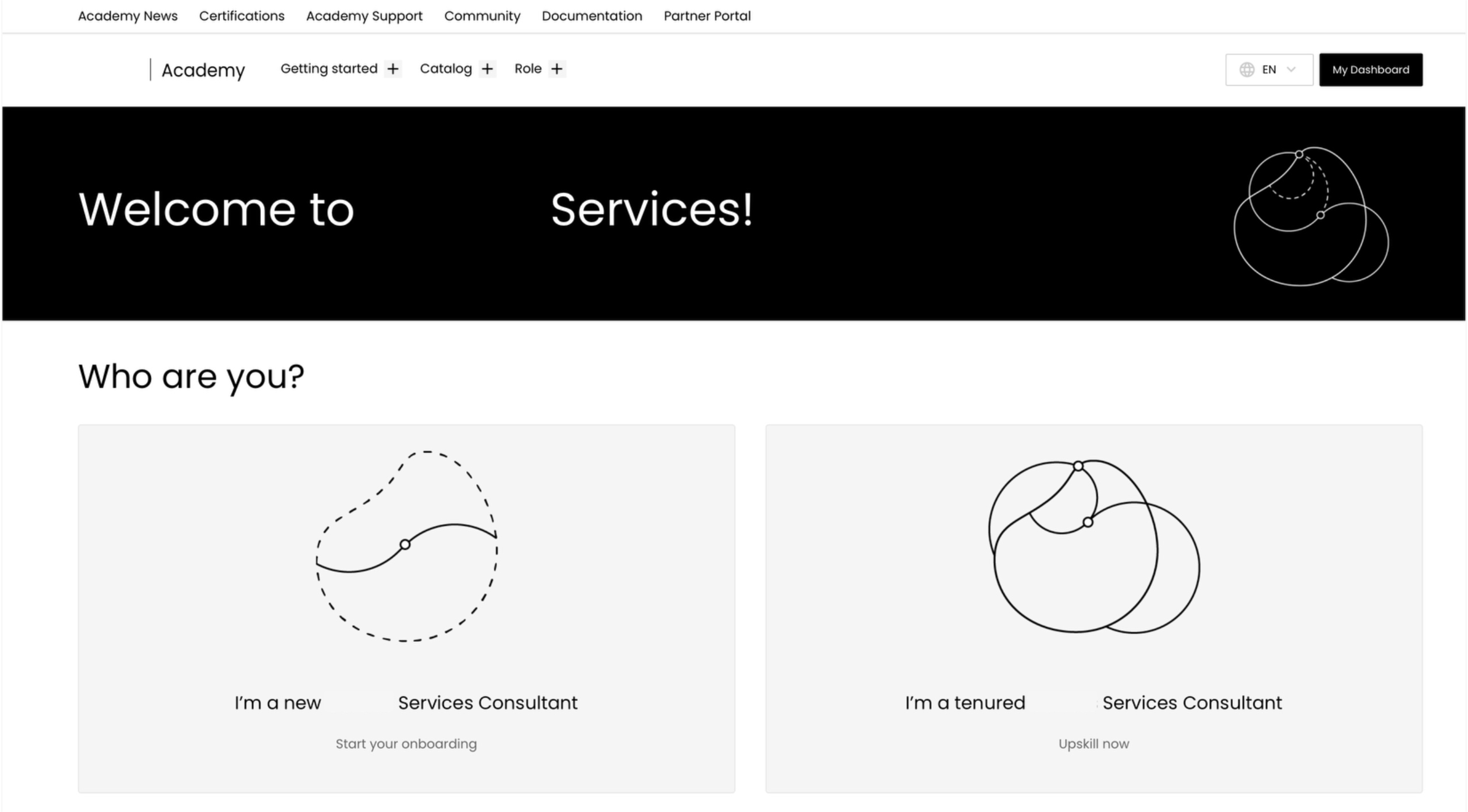
Two Learner Paths
Inside each department space, learners chose their path:
- New to the department? → Onboarding path
- Experienced in the role? → Upskilling path
This wasn't just a UX decision — it was a learning design one too.
Presenting weeks of structured onboarding to someone who's been in the role for two years creates noise and erodes trust in the platform. Separating the paths let us design each one properly for the person actually taking it.
Structured Pages for the Learner Paths
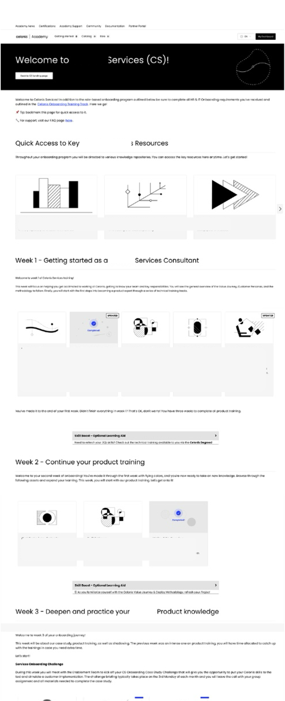
The onboarding path followed a 10-week scaffolded journey, designed in close collaboration with Enablement Managers who brought deep knowledge of their department's needs.
The sequence was deliberate:
- Week 1: Department orientation: what the team does, who leads it, how it's structured
- Week 2: Technical overview: foundational concepts and tools
- Weeks 3–4: Deep-dive into core technical skills
- Weeks 5–6: Business context: how the department connects to the wider organisation
- Weeks 7–10: Advanced skills, external tasks integrated at relevant points, and a final capstone project
The sequencing followed a need-to-know before nice-to-know principle, grounding learners in context before asking them to engage with complexity. Some early drafts from Enablement Managers had certain weeks significantly overloaded; part of my contribution was identifying those pinch points and redistributing content across the journey to keep cognitive load manageable throughout.
External tasks — activities that happened outside the LMS — were embedded at the right moments in the journey with clear instructions. Enablement Managers retained ownership of running those tasks; we just ensured they sat in the right place in the sequence.
I authored the courses and assessments within the LMS and built quizzes at key points to reinforce learning before moving to the next phase.
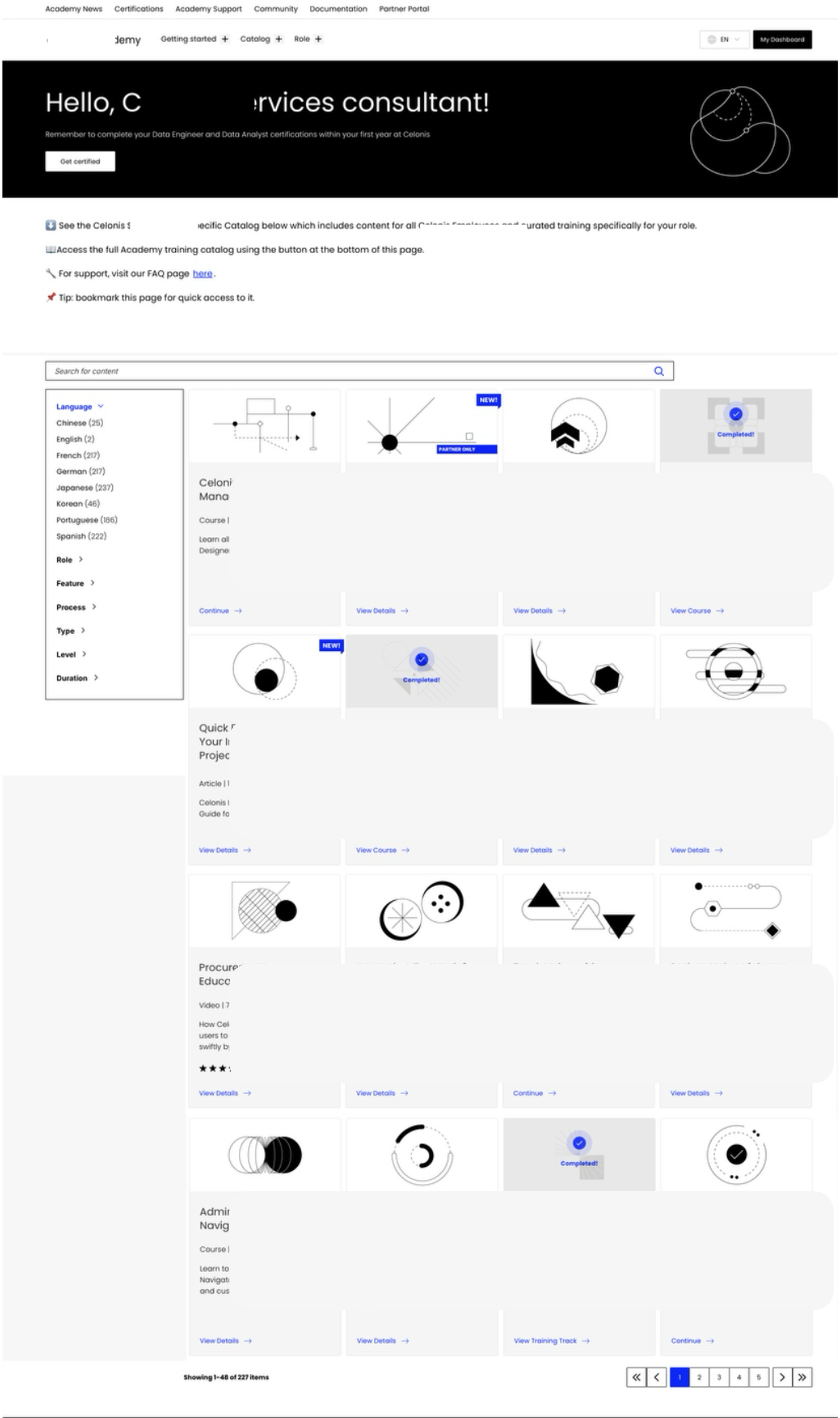
Visible Progress
Each course and training track showed a clear completion indicator, a tick on the card when done. This gave learners an immediate sense of momentum and made it easy to see what remained.
A platform limitation prevented us from adding an overall progress bar across the full 10-week journey, something I pushed for and would prioritise in any future iteration. Within constraints, completion indicators at the course level were the most effective signal we could give.
Scalable by Design
The modular structure meant adding a new department didn't require rebuilding. LXDs could replicate the architecture, swap in department-specific content, and have a new space live without starting from scratch.
Impact
What I'd take forward
This project is the clearest example of what I mean by hybrid design. The UX decisions of the department spaces, the learner path split, and the simplified landing page only worked because they were built on learning design thinking. And the learning design decisions of the week-wise scaffolding, the cognitive load management, and the sequencing only landed well because the interface made them navigable.
Neither lens alone would have solved this. The Excel sheet wasn't just a UX problem. The overwhelm wasn't just a content problem. The solution had to hold both at once.
The biggest constraint I'd push back on in hindsight: the overall progress bar. Learners completing a 10-week journey deserve to see how far they've come. That's not a nice-to-have — it's a fundamental part of what keeps people going.